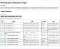
There are several things that you can do via the "User Control Panel," and by selecting "Digests," which is the last tab to the right:On this screen, you can have this digest delivered daily, weekly or monthly. Or you can unsubscribe and not receive it at all. You can also select the time that you wish to receive this. The time of delivery will be based on the time zone that is set in your "Board Preferences," which can be accessed on this same screen in the "User Control Panel."
The other menu choices under "Basic" allow you to make other changes that affect what you will see in your digest. They are self-explanatory.
If you make a mistake, you can always return to the default choices and select "Reset" on any of the pages to return them to the defaults.
You can have Personal Messages (PMs) included in your Digest, although you will need to enable that feature.
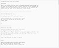
There are five visual styles. Note that the text-only version has no hyperlinks. Each image below will open a larger version in a new browser tab.
| Styled no tables | Styled with tables |
 |
| 
----------------------------------------
| Plain no tables | Plain with tables |
 |
| 
----------------------------------------
Text only - no links

You can switch between these styles until you find the one that you like.


